Serving the intelligence community in both government and commercial sectors, Bridges came to us while they were in the process of evolving their company culture, with the desire to reflect that change in their core brand. CEO Chuck Faughan III, along with his leadership team and a diverse group of employees were selected to be a part of the research and strategy sessions. From the very basis of their name through to branding points within a new company headquarters, Bridges trusted Hersick+Webster to lead their employees, clients, and the public to understand who they are, and the incredible impact they make to countless people.
Process
With over 15 years of impactful experience – both with its client base and its employees – it was important to learn from listening groups and surveys about the existing strengths of the brand before making changes. In the early stages of research, we learned of the positive value that exists in the Bridges name as a go-to company with trusted expertise. Bridges’ level of rigor and security that they consistently deliver for federal customers is an asset for their additional growing client bases. Within the company, there’s a vibrant culture with a strong desire to make a difference for the country, community, customer, and coworkers.
A clear vision forward
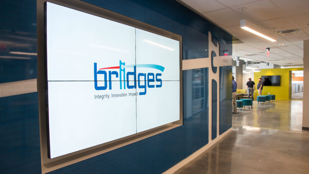
With age, as well as superb services, comes certain attributes that span over time. As such, honoring the legacy of Bridges was important in the development of its brand identity. Initial logo explorations branched into various expression types. Ultimately, the decision to tie in a visual homage was critical to visually communicating the company’s direction. At its core, the beam tells the story of what Bridges does with great impact, showing how problems are transformed into a solution –the Bridges way – with energy and movement, accentuating the progress and the solutions that they offer.
We also revised the primary color palette to reinforce Bridges’ existing brand strengths while broadening their visual language, which enabled us to better emphasize their culture and personality. By introducing bright, bold colors alongside updated typography, the logo has the ability to play an active and dynamic role in its current and future applications for the company. The new identity of Bridges was then applied to stationery, collateral, advertisements, promotional materials, as well as a responsive website.
Space to grow
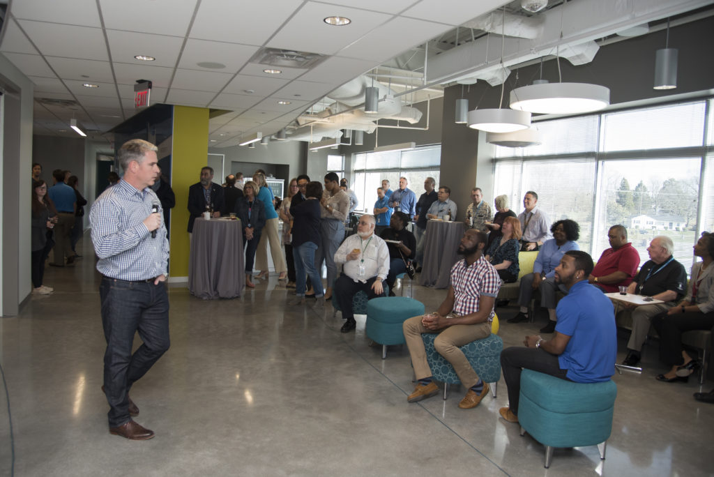
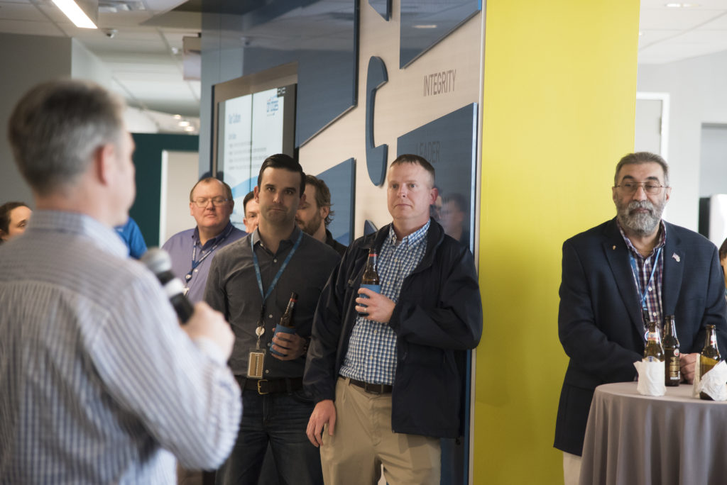
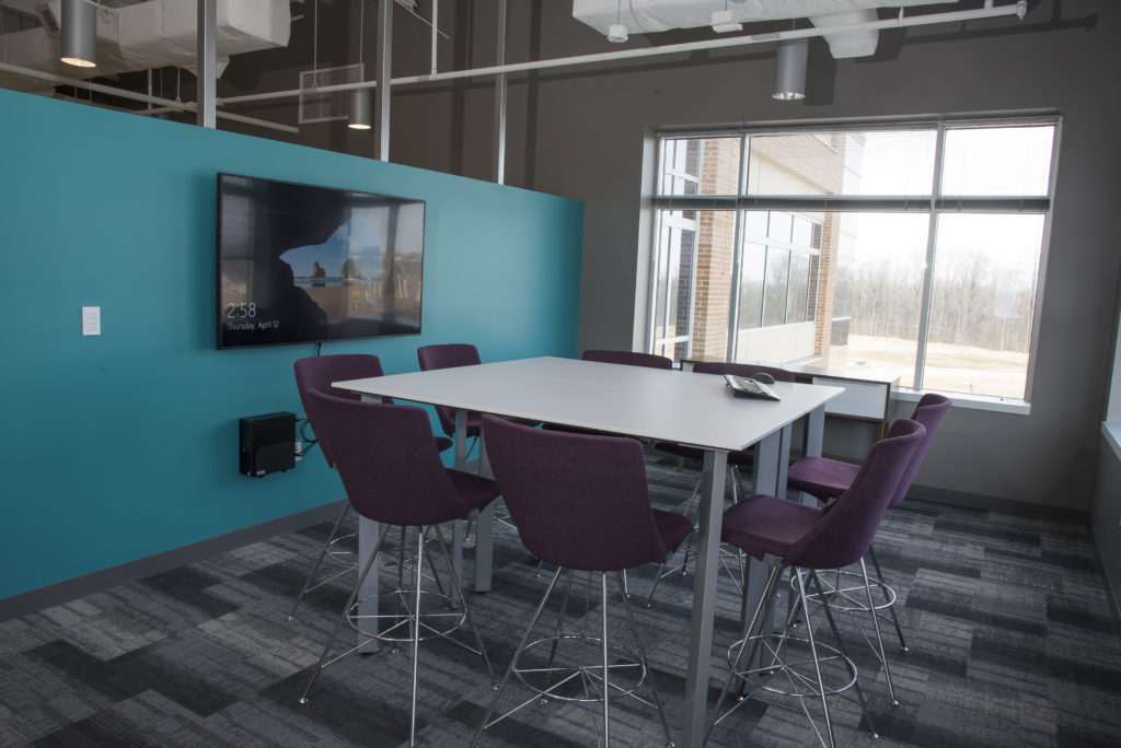
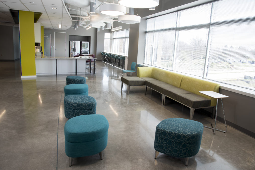
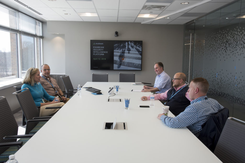
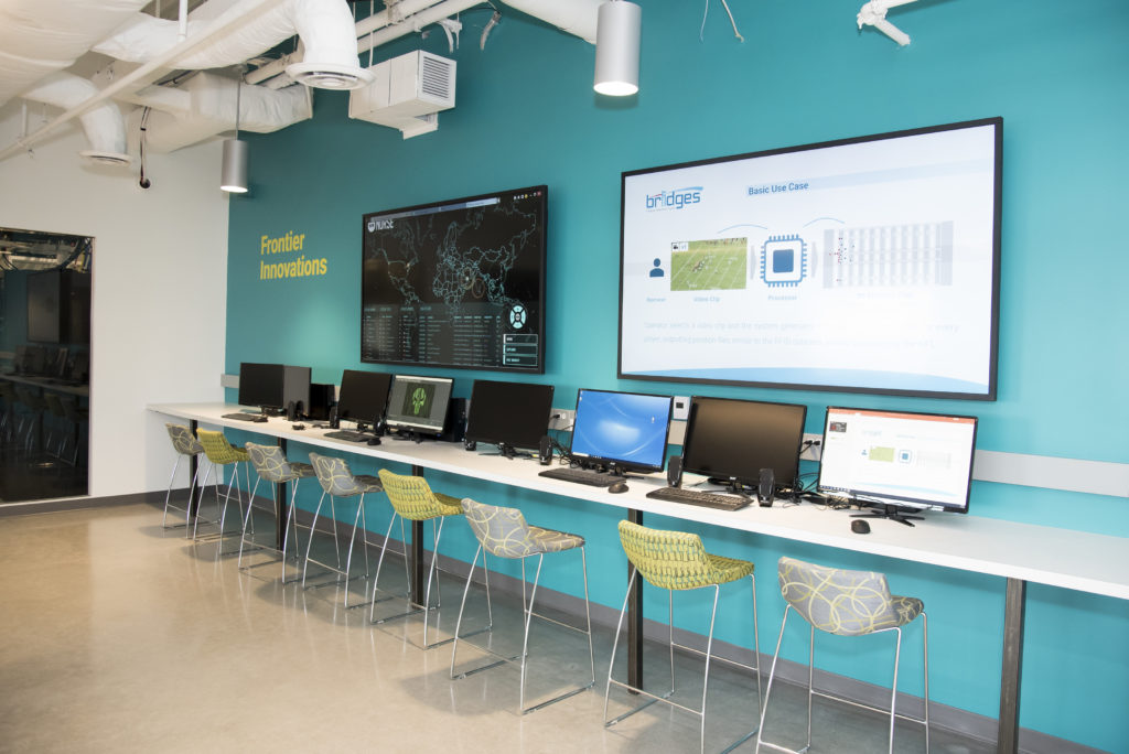
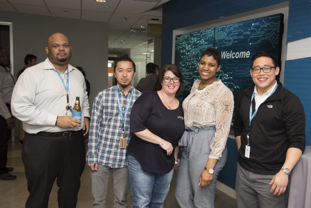
To reflect their bright, new direction, Bridges moved to a new headquarters to better exemplify their culture shift and give them the room for their projected growth. With new gathering and workspace areas, Bridges’ new home is designed to foster collaboration, engagement, and innovation for their employees, customers, recruits and prospective clients. In the new building, Hersick+Webster presented and finalized concepts to bring the brand to life, including an impactful foyer and lobby space and engaging boardroom, as well as various brand touch-points throughout the expanded headquarters. Working alongside the construction and interior design teams, JLL and Arris Design, the environmental branding is a vital way for Bridges to tie-in their core values and new identity throughout their headquarters.

Results
Throughout the full process, the feedback from the team at Bridges has been thoughtful and overwhelmingly positive as each stage of the branding was released leading up to key milestones and company events.
Want to see more work from the rebrand? Check out our project samples here.
Services provided:
Name, brand identity, advertising, collateral, copywriting, research and strategy, voice and tone, website design, environment branding
